
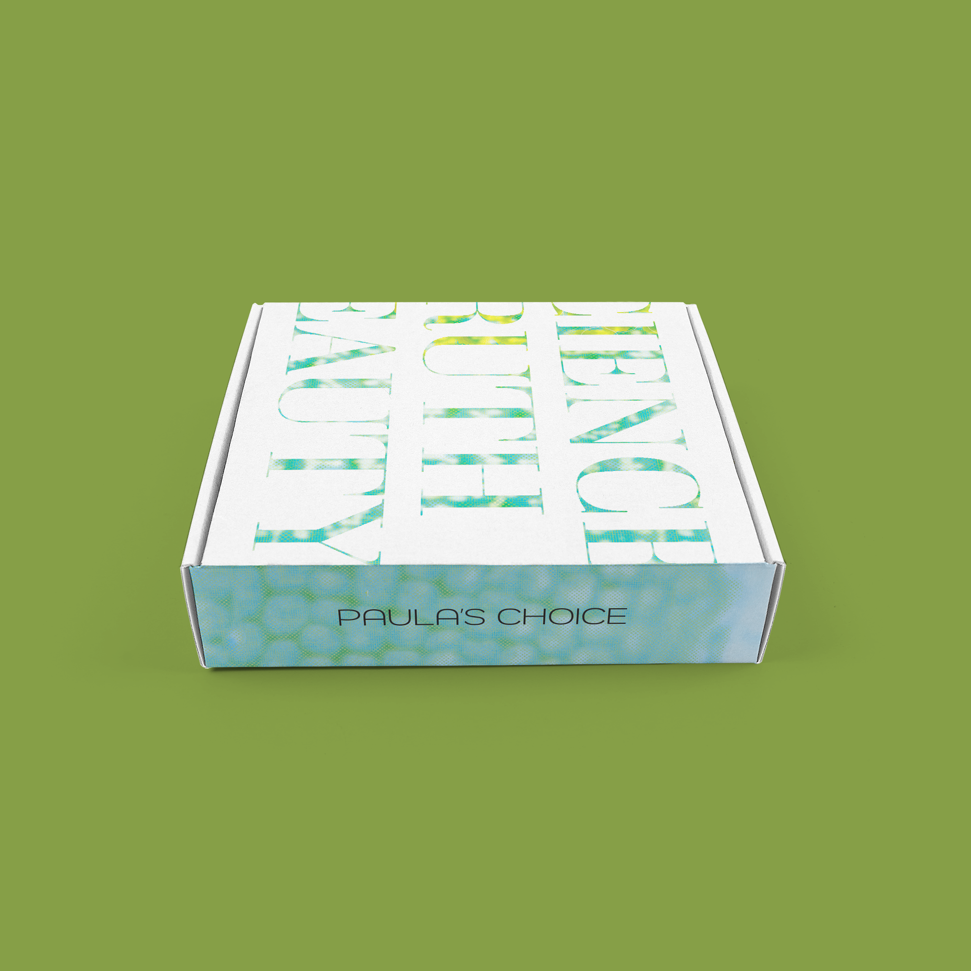
Paula’s Choice Packaging Design
With an increase in Clean Beauty, consumers are wanting natural ingredients in their skincare products. Paula’s Choice is known for the honesty and science behind their brand—the packaging should reflect this along with providing competition on the shelf within a retail space.

HONEST
ESTABLISHED
FRESH
SCIENTIFIC
CLEAN
APPROACHABLE
MINIMALISTIC
ABSTRACT
The packaging upholds the new brand identity system while engaging with the customer in a visually stimulating way. Showing a brand that’s sticking to their roots—but dynamic enough to show their true beauty.
The abstract elements allow the Logo to shine, allowing the product to stand out amongst other competing products.
SCIENCE. BEAUTY. TRUTH.

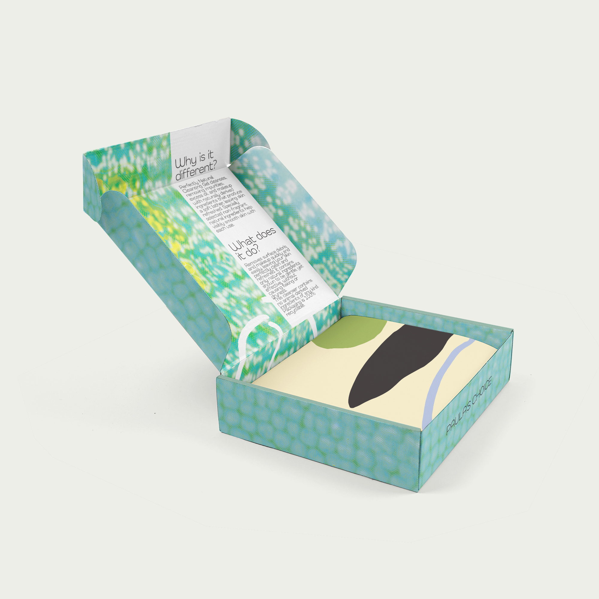
Packaging for the Earth Sourced Gel Cleanser that would arrive inside the cardboard mailer.